How step by step learning path affected our users retention?

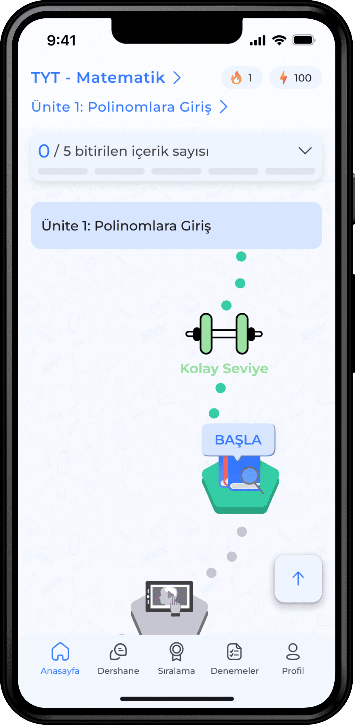
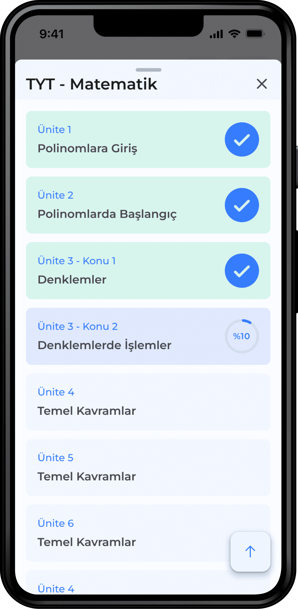
It has become very difficult for a student between the ages of 14-18 to access good teachers and content suitable for their level, or it has become a problem that can be solved by spending a large amount of money.

What if we could help the students to reach their goals and true potentials?

What is Voltran?

The platform that brings together the teachers and their content with the students. Voltran’s vision is to solve the problem of access to quality education and the inequality of opportunity arising.

Challenge

Learning and studying consistently is an effort, just like doing a diet or working out regularly. You know it’s a must for your improvement, but you’d rather stay at home and relax.

What I discovered during user-tests is that browsing the app to choose a lesson or content was also an effort. We couldn’t ask for double-effort, we needed to fix the app so that users could focus their energy on what matters to them: progress as quick as possible.

2022

Team

I was working in duo with the Flutter Developer, including him in design decisions right from the beginning.

I was also working and discussing with the CEO (also Product Manager), and the Content Editor as I believe UX needs to take into account all disciplines.

Role

As the only designer on the team, I was responsible for the end-to-end design process, including user research, concept development, prototyping, UI design and usability testing. I redesigned the whole product on cross-platforms (iOS, Android and Web) from scratch, simplifying the entire user flows and access to content.

Research

During user calls

90%

of users most like live lectures and interaction with teachers

60%

of users feel overwhelmed when they see all content in one screen

70%

of users wish to have a step by step studying program by their own level

Results

After launch

3%

lift in content completion rates

65%

lift in who view the homepage and then start content

Brainstorming

Everyone is involved from the beginning

PM, Developers, Stakeholders and our Content Editor were involved to build the concept. Building the concept together was key in uniting the team: we had a common problem to solve.

The developers were motivated to go higher and greater by this

That happened because they were building the concepts with us — and as a result, wanted to give the best experience to our users as possible.

An iterative process

It took us some time to land on something we were satisfied with. Many usability tests and rounds of feedback were necessary.

SOLUTION

Before

The previous interface had all lessons list and contents in one screen, which was creating an overwhelmed situation, was hard to decide for starting point.

After

In the new design, the content is divided into units, units are further divided into contents based on their difficulty level. Therefore, the whole plan is spaced out and thus easy to follow and complete.

Decision Process

Users landed on a lesson and content list with no other clue, other than its title, to make their choice. This version was not helping users to figure out whether the content was right for them, which induced a high cognitive load.

Decision Process

To better help users decide where to start studying, lesson and unit names are put on the top of the screen so that they could reach easily without distracting. Adding represented content icons and progress is an essential visual clue that helps reduce the cognitive load while jumping between content steps

Before

It required a lot of effort to find content to study in a specific lesson or unit. They had to tap the back button constantly to return to the lessons list, resulting in churn. All contents were shown in a list with no hierarchy based on difficulty level, unless users filtered it.

Users couldn’t track their progress in a lesson or unit. To find out, they had to go in Profile Page and found out their progress by lessons. To resume studying, they would go to Class again.

There were no motivational elements to keep them continuing their studies. Additionally, users learn better when activities are broken down into smaller tasks, yet all contents were on the same page, under different tabs. There were no experience points or badges to make them feel as if they were improving and leveling up.

After

Users could directly land on a specific lesson and unit based on their answers in the onboarding process. They could choose to start studying from scratch or start from their level based on the level test in the onboarding process again.

We merged all content and lessons, yet at the same time, divided them into steps and placed them on the homepage, creating a single point of entry.

Human nature is more about keeping track of progress—the Zeigarnik effect. Due to that, we put all units in a list and they could easily track their progress in this slide, without landing another page.

We worked on UX writing in gamification. We had to keep users motivated, so we tried to create an empathy gap and communicate with them in an understanding way by tapping into users' emotions.

Provide them with opportunities to earn badges, streaks, and experience points by studying, so they can learn, stay motivated, and compete at the same time.

I have designed several components/pages representing different steps and decisions.

The screen indicating the starting level based on the test result

The screen that appears at the end of the unit. When you select "Choose Unit," it navigates to the units screen, and when you select "Proceed to Next Unit," it continues on the homepage.

The screen that appears when you want to jump to the next level

The screen that appears when you want to skip a unit. If you click on another unit before finishing one on the units page, and/or switch between units on the homepage, when you click the JUMP HERE button, you will see this screen

The "Find where I should start" option directs users to a level determination test, determining their starting level based on test success. Then, they begin from the initial resource at that level. Choosing "start from the beginning" leads users to the homepage, starting at the easy level of the selected unit's initial resource.